This post is to research album advertisements so i can obtain ideas for my album advertisement.
This advertisement is for Blink 182
I like the simplicity and strtucture. The fact that the band are the main focus of t advertisement. Simple yet effective publishing
However i feel that maybe that the colours (dry brown) provides a warn effect, however the contrast of the colours on the album draw your eyes to that as an imediate focus
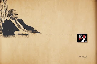
These advertisements are for green day
I shall mainly focus on the first advertisement as it is too do with the album. I like the artistic license. The record itself has a political theme, therefore by adding the imagery it provides the characteristics to the what the album will be like. I also like the use of colours, they provide a classy sepier effect almost like the picture was portrayed on a brown paper bag, which i feel is a cool effect
This advertisement is for daft punk
This advertisement coincides with the release of a walt disney movie. Tron. The reason i like this is because that it isn't only promoteing daft punk but promoteing the film. I like the futuristic and dark vibe. Its simple yet effective and i feel that in this case less really is more.
This advertisement is for U2
This is an example of cross media convergance. They aren't promoting an album but a product (the blackberry), distributors use established household names to shift units. I like the imagery and the red vortex/ arena. It provides an epic out of this world vibe


No comments:
Post a Comment