Friday, 19 November 2010

Post 22: Band myspace's

In this post i shall be looking at bands myspace's to obtain information regarding how they create an atmosphere using color placement and imagery. I will be looking at bands scoping all genres.

The first bands myspace i'll be looking at is techno band The prodigy


Likes
How the green provides a neon rave sensobility.This colour is assosiated with the raving ethic due to its brightness
The rough imagery provides a DIY quality. This provides a down to earth quality

Dislikes
The grey clashes with the green making it hard on the eyes however it coincides with the rave asthetic

The next band is skate band set your goals


Likes
The imagery is quite artistuc and was drawn by one of my favourite artist's Drew Millward
The use of blue's and beige's provide a sombre look
Dislikes
Nothing

The next band is Sum 41


Likes
The blue colouring makes the web page feel very mature in the sense that the colours used can be assosiated with militarial colouring

Dislikes
The placement of the band at the top looks quite awkward uncomftable. They focus there stare outwards

The next band is the lonely island, They are a comedy rap group


Likes
I like how they incorporate there album cover into the page

Dislikes
I actually dislike the page as it doesnt feel very accesible to others, however it retains a sense of comedy

The next myspace is for alternative DJ Mark Ronson
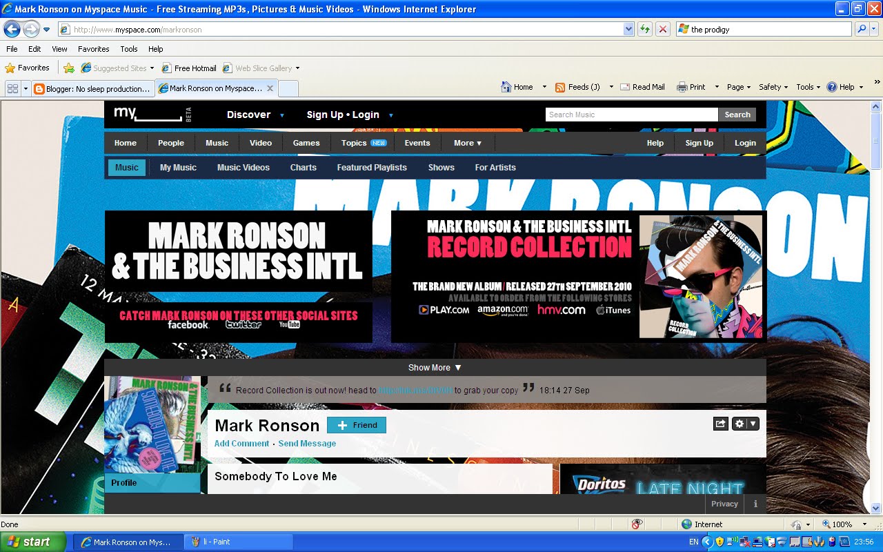

Likes
Once again influenced by the album cover
It maintains a DIY sensibility
The use of colours makes it feel like it's from the 8o's

Dislikes
Nothing

The last artist's myspace is Morrissey. He creates alternative rock


Likes
How his face is the distinguishing factor
His face has become so recogniseable that it sells the records
Its quite simplistic

Dislikes
The colours are quite boring
There isnt much happening on his myspace

Tuesday, 12 October 2010

Post 21: idea change

Ive changed my original idea a little bit

As aposed to having toy robots i will be using cardboard robot heads
Its more cost effective
Its easier
Overall i think it will be more effective

They will be numbered to show ranking

Actors will wear hoodies and hold baseball bats to provide an urban asthetic

There will be moments of colour

We will be seeing main actors face now
I feel that the actors face needs to be shown to add emotion
Just close ups may have become stagnant

Too get an understanding of the product i am trying to create i have created a storyboard

Monday, 13 September 2010

Post 20: The prime example

It was only after researching music videos i found this video

Its a remix of Brian eno's an ending remixed by Micheal Dow


The reason its a prime example is because
Its artistic
Its in black and white
It conveys a strong story
It uses techno music
And also it doesnt have the band in it

Friday, 10 September 2010

Post 19: Music video director No3

The last director i will be looking at is Marc Webb who has directed videos for
Green day- Waiting (2001)


Likes- The use of colours
The fact theres no real story
The slow motion defies convention

Dislikes- The lack of story makes events a little confusing

Yellowcard- Ocean avenue (2003)


Likes- The bright colours
The repetition
The story
The scenary

Dislikes- Nothing

Brand New- Sic transit gloria (2003)


Likes- The use of colour
The story

Dislikes- How the song doesnt really fit in with the begining

To more recently Maroon 5- Goodnight goodnight(2008)


Likes- The before and after effect

Dislikes- I dont find the actual video apart from the double feature very intresting

And green day- last of the american girls(2010)


Likes- The strange placement of props
The filter used provides the colour with a sense of richness
The actors in the video
The way the band really interact with the camera seperates it from other camera interaction because its over amplified

Dislikes- How it ends on a cliffhanger

Post 18: Music video director No 2

The second director more famous director is Samuel Bayer who has directed a huge backcataloge of music videos. Some include

Nirvana- Smells like teen spirit (1991)


Likes- How it has a raw edgey look
How background actors are puting there all into the video
The orange filter makes the video look intense and hot/sweaty

Dislikes- That theyres no relief. Theyres no real break or change.
This can be good because then the video stays in your head

Blink 182- Stay together for the kids (2001)


Likes- How it has a blue filter
It provides a mature nature
The raw asthetic and interaction from band and background actors
The sentimental messages at begining and end of video

Dislikes- Nothing

The last video is from My chemical romance- The black parade (2006)


Likes- The dark filter
The use of actors
The strange scenary, props and clothing
The way the story is told throughout the video

Dislikes- Nothing

Post 17: Music video Director No1

In this post i will be naming some famous music video directors and showing some of their work

The first director who is quite famous is Mark Kohr
He has directed videos for
Alanis morrisette- hand in my pocket (1995)


Likes: The use of mixed media


Jawbreaker- Fireman (1995)


Likes: The semiotics of colour give the video a vintage look

Thursday, 9 September 2010

Post 16: Audience and institutions

In this post i will be explaining who my audience is and explaining why i need to need to understand the usefullness of audience's and institutions.

Understanding audiences and institutions helps us who to aim the product at.Without it the product fails to meet expectations expected by institutions,

Cetain major musical institutions which make videos aswell include.
Warner music
EMI

Other more indipendent musical institutions include
Slamdunk records


The audience im aiming for is a mature one who are between the ages of 19 and 40.
The video is inteded to be quite serious with the twist of apllying robots to it so that 19 year olds are intrested with the comical aspect.

Im trying to encapsulate an indipendent movie feel within the video.